Understanding Design in Photography
What Is Design in Photography?
When we hear the word design, we often think of graphic arts or interior decoration. But in photography, Principles design is just as crucial—if not more. It’s all about how you arrange the elements within your frame. Think of it as the secret sauce that turns a random click into a captivating image. The shapes, lines, colors, space, and textures? They all work together to communicate something powerful.
Why Design Principles Matter in Photography
Design principles are the rules of the visual game. They give your photos structure, harmony, and impact. Whether snapping a street scene or capturing a mountain landscape, knowing how to guide the viewer’s eye through your shot makes all the difference. It’s like being a visual storyteller—you get to decide where the story begins and ends.
The Core Principles of Design in Photography
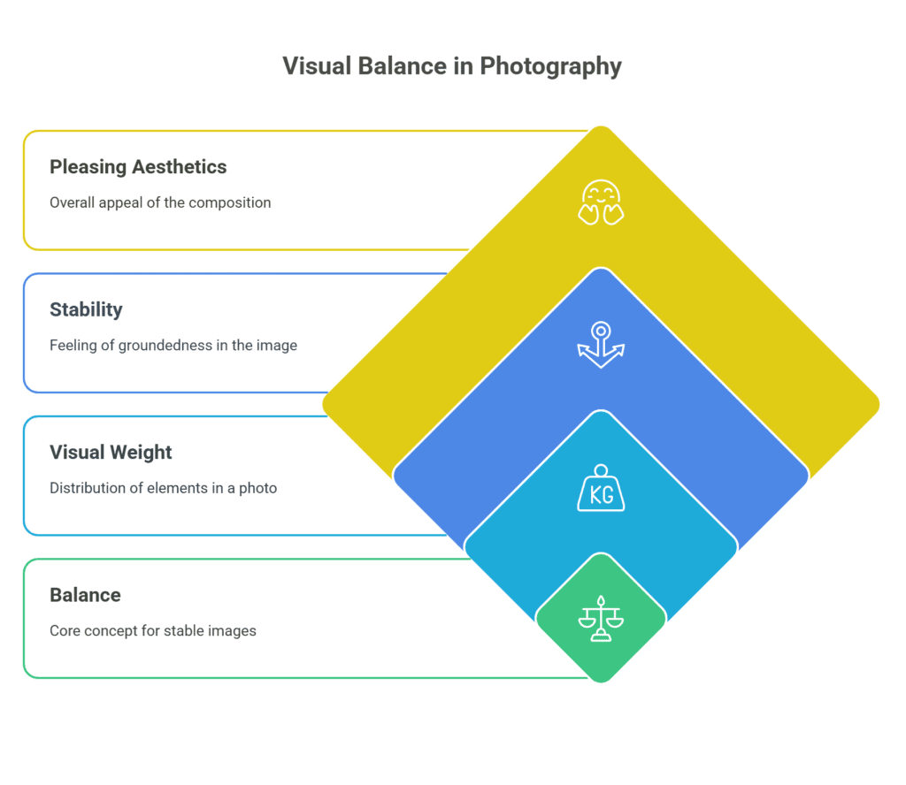
Balance
Balance is the backbone of a well-composed photo. It’s about distributing visual weight so your image feels stable and pleasing.
Symmetrical vs. Asymmetrical Balance
Symmetrical balance is like a mirror—everything on one side has an equal counterpart. It’s calm and structured. Asymmetrical balance, on the other hand, plays with unequal elements that still feel right together. It’s more dynamic and modern.
Contrast
Contrast is how you make elements pop. It adds drama and excitement.
Using Light and Shadow
Have you ever seen a black-and-white photo that feels more alive than color? That’s the magic of contrast. Play with lighting angles, exposure, and backgrounds to highlight differences in tone and texture.
Emphasis
This is where you draw attention. What’s the hero of your shot?
Creating a Strong Focal Point
Use light, color, focus, or positioning to highlight the most important subject in your frame. Your viewers should instantly know what you want them to see.
Movement
Photos might be still, but your viewer’s eyes should dance through them.
Leading the Viewer’s Eye
Use lines, shapes, or blurred motion to suggest direction. Roads, rivers, or even a pointing hand can guide the gaze through your composition.
Pattern and Repetition
Patterns are visually soothing and can add a sense of rhythm to your image.
Visual Rhythm in Frames
Whether it’s a row of trees or a series of windows, patterns create harmony. Break the pattern with something different to make it even more interesting.
Proportion
Proportion is the size relationship between elements.
Size and Scale in Composition
Use a scale to exaggerate or diminish your subjects. A tiny person against a mountain backdrop instantly shows grandeur.
Unity
Unity is when all parts of a photo work together as a whole.
Achieving Cohesiveness in a Shot
Stick to a theme—be it color, mood, or lighting. This helps your photo feel intentional and complete.
Variety
Without variety, your photos can get boring.
Mixing Elements to Avoid Monotony
Introduce contrasting textures, unexpected angles, or bold colors to spice things up. Just don’t go overboard—variety should support, not overpower.
Space
Space gives your subject room to breathe.
Positive vs. Negative Space
Positive space is where your subject lives. Negative space is everything around it. Use the empty areas creatively to focus attention and add mood.
Applying the Principles Creatively
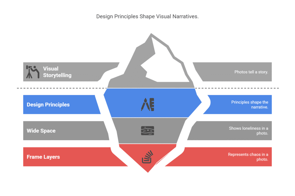
Telling Stories Through Design
Every photo should tell a story. Use design principles to shape that narrative. Want to show loneliness? Use a wide space. Want to show chaos? Fill the frame with layers and movement.
Using Design to Evoke Emotions
Colors, shapes, and composition evoke emotions. Curved lines feel soft and welcoming. The harsh contrast feels dramatic. Understanding this helps you create emotional impact, not just visual appeal.
Mistakes to Avoid in Photographic Design
Overcrowded Frames
Trying to say too much in one photo is a classic beginner mistake. Give your subject room to breathe.
Ignoring the Rule of Thirds
Centering everything can make a shot feel flat. Use the rule of thirds to bring energy and direction to your frame.
Tools and Techniques to Master Design
Grids and Composition Guides
Use your camera’s built-in grids or mobile editing apps to align your elements properly. It’s a game-changer for composition.
Post-Processing Enhancements
Editing is your final touch. Adjust brightness, contrast, saturation, and cropping to enhance design without overdoing it. Subtlety is key.
Practice Makes Perfect
Daily Photo Challenges
Take one design principle a day and try to capture it. It keeps you sharp and boosts your creativity.
Studying Famous Photographs
Look at iconic images and dissect their design. What makes them great? Try to recreate the same feeling using your own subject.
Design in photography isn’t just about making things look pretty—it’s about guiding the eye, sparking emotions, and telling stories. Mastering these principles takes time and practice, but once they click, your photography will go from snapshots to masterpieces. So grab your camera, go out there, and shoot with purpose.
Frequently Asked Questions
1. What is the most important design principle in photography?
While all principles matter, balance and emphasis are foundational. Without them, your photo can feel chaotic or confusing.
2. Can I break the rules of design?
Absolutely! But first, learn them well. You can’t break what you don’t understand.
3. How do I create depth in my photos?
Use leading lines, layering, and foreground/background elements to add depth and dimension.
4. What’s the easiest principle to start practicing?
Start with the rule of thirds and contrast. They’re simple yet powerful.
5. Do these principles apply to smartphone photography?
100%! Whether you’re using a DSLR or an iPhone, design principles work the same. It’s all about your eye—not your gear.